MilkPEP
(as in GotMilk?)
Trade publication ad
Milk Marketer of the Year
Every year, MilkPEP holds a competition to award the milk processors with the best sales. They award them as the Milk Marketer of the Year.
After contemplating interesting and unique ways to visualize an award, I thought about using the negative space of a cow spot as a trophy.
School Milk Cartons
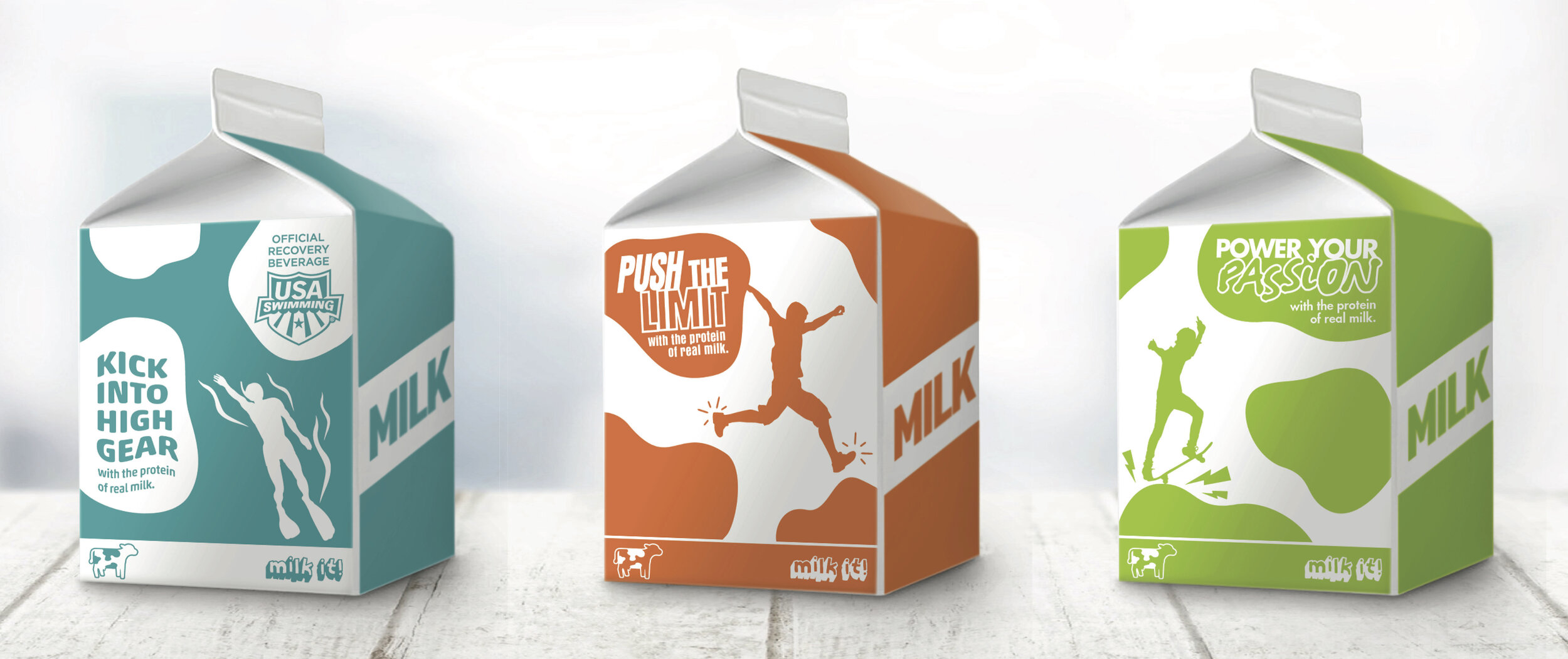
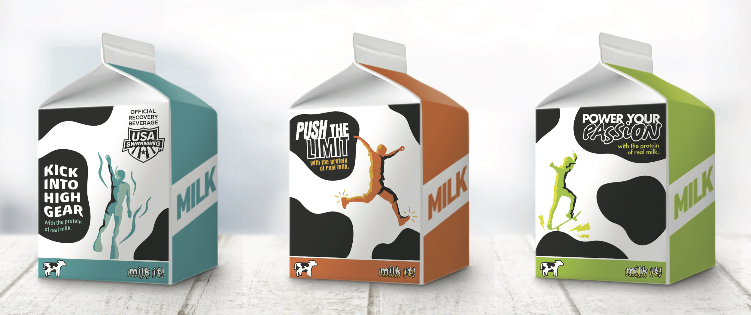
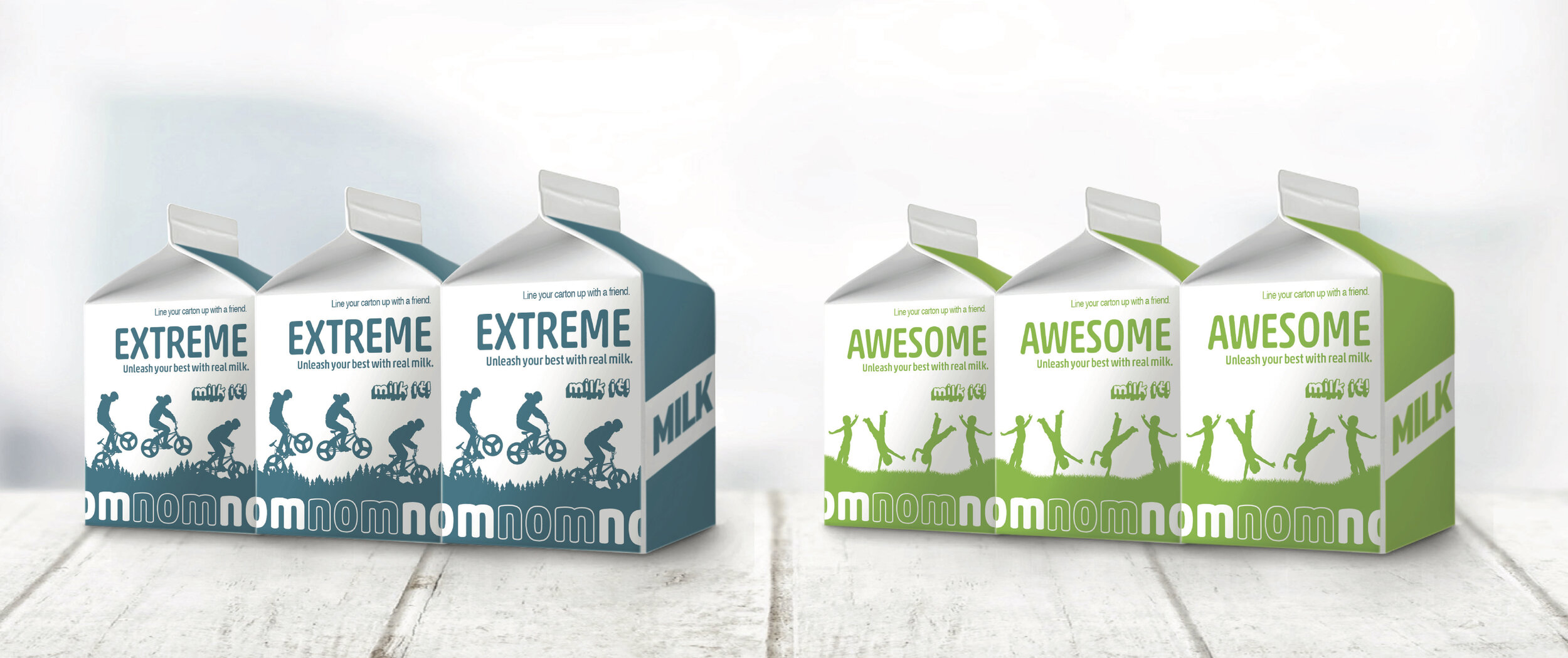
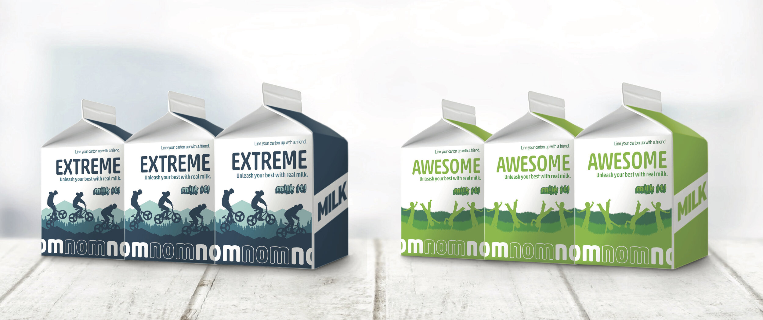
It’s been quite some time since school milk cartons have been revamped. I’m glad this project fell to me because it was a lot of fun. Each one-color design had to translate to three-color as well.
Fun Fuel Milk gives kids the energy they need to do the things they love. This design visually connects milk with the activities it powers by using the cow spots as a means for action. Shadows and highlights of the vectors brought this one-color to life.
Keep It Going Milk helps kids do more of what they love with their friends. This design is interactive, prompting kids to line up the cartons, to show how milk keeps the good times going. And going. And going. Layers of backgrounds in analogous colors enhanced this one-color.
Back-to-school
IN-STORE campaign
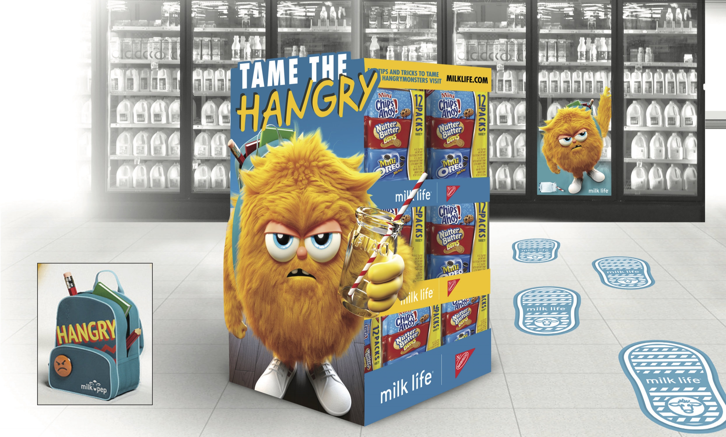
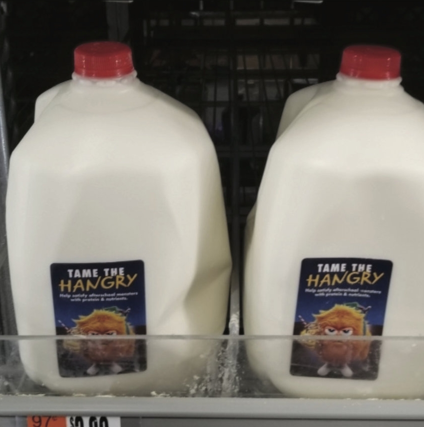
My team’s goal as MilkPEP’s shopper marketing agency is to sell more milk. (Obviously.) During the 2018 back-to-school time frame, our strategy was to encourage mom’s to get kids to drink one extra glass of milk a day, more specifically after school.
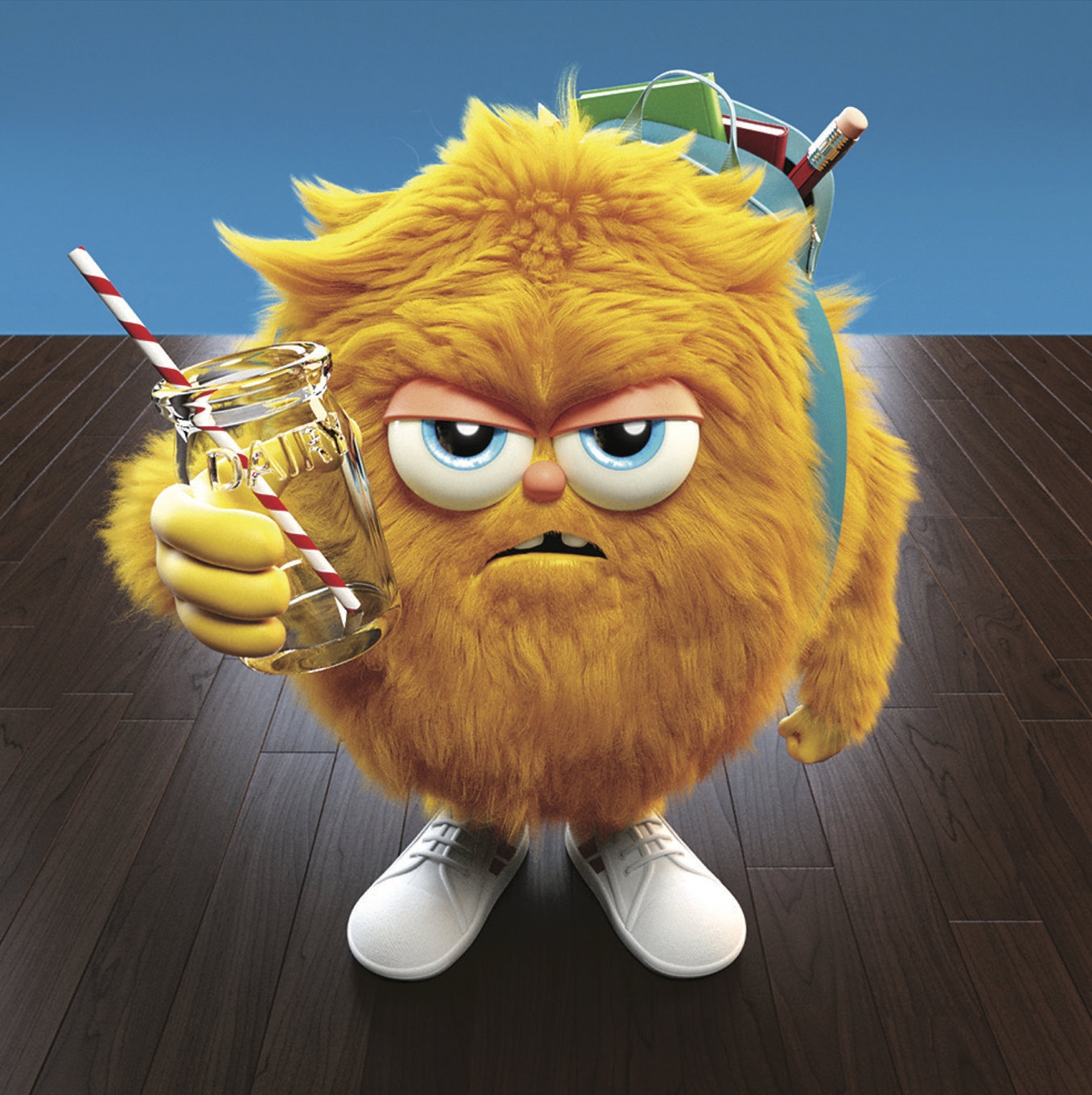
Unfortunately, with schools being so packed, some kids’ lunch hours are around 10:30 AM and don’t get home until 2:30 or 3:30. Meet Hangry. He is the personification of the emotion/feeling of being hungry + angry. He comes home from school–depleted, starving, dramatic–and he needs a glass of milk with his snack to keep him going for the rest of the afternoon and satiate his hunger until dinner.
We created the idea of Hangry and what he would look like, and worked closely with a 3D artist to bring him to life.


